I don't think the phrase "You can't judge a book by its cover" was ever meant to be used in reference to actual books, because not only
can you do exactly that, but it is done all the time. and without remorse. I'm pretty sure I've bought a book simply because I liked the way it looked. Who wants to be seen reading an ugly book? So, I don't care what anyone says, I'm about to judge lots of books by their covers. Here are my picks for best and worst book cover design.
note: I have not actually read most of the books on this list, nor have I viewed the covers of all the books out there. I'm sure there are prettier and uglier ones in existence. Please feel free to suggest other ones I should include. Maybe I'll do a "part II" best and worst list some day.
THE BEST (in no particular order):
 |
| I love the use of the "Peanuts" font and the iconic Charlie Brown shirt design |
|
|
 |
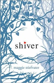
| There are a bunch of recent YA covers that I love, but I think this is my favorite. |
 |
| They say you aren't supposed to have white covers on books anymore because they don't stand out enough on Amazon.com, but I think both Jurassic Park and its sequel pop just fine. |
|
 |
| The book may have turned out to be a not-so-true "memoir", but I still love the concept of the cover. |
 |
| Love the font and the Shel Silverstein drawing. |
 |
| What could make you feel more like you should be sitting in a nursery reading this to a child? |
 |
I've been lucky enough to only have had 2 migraines in my life,
but I'd say this is a close representation of what my head felt like then. |
 |
This cover gets bonus points for putting in the effort to not only put the dog upside-down,
but cut out as well. |
THE WORST
 |
| I didn't know Beethoven was a pedophile. |
 |
| I actually read this one. I think they've since changed the cover. I wonder why? |
 |
I get it is supposed to be teaching kids about death,
but did you have to use creepy Halloween-y font and put the dead bird right on the cover? |
 |
| This is just one of many bad romance novel covers. |
 |
| When I first saw this cover I thought it was a sci-fi book about aliens with exceptionally long legs and big feet. It's not. |
 |
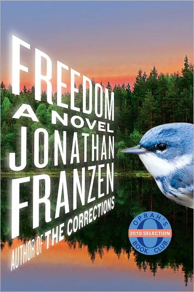
| Bill, do you have to be on the cover of all your books? And putting the price right on the front of the book isn't tacky at all. Nice comb-over, by the way. |
 |
| The not-so-human centipede? |
 |
| I don't really have a specific reason, I just hate the cover of this book. A lot. |


I just wrote my comment then it disappeared! If you see it twice it's cause something funky happened. Oh well, take two...
ReplyDeleteYou found some really bad covers! I agree with your comment on Franzen cover. I have no desire to read that book and it's mostly cause of the cover!
Interesting to note, often the authors don't have much say in the covers. I've hear from more than one that they are sometimes surprised (in a good or a bad way) with what the publishers choose.
You should write a post on different covers for the same books! Sometimes they change the cover design for paperback or additional publishing rounds. Movie covers I get why they do it (for publicity), but sometimes I'm not sure why they change (especially when I like the first cover better).
Ooh, good idea! I will definitely do that. Whenever I want to read a book that has been made into a movie, I specifically search out the original cover so that I don't have movie stars faces on the book. I also found a site about covers that were made, but then never used (for whatever reason). I actually liked a lot of those ones too. Someday, I might actually put a review on here! :)
ReplyDelete